Hello Everyone
It's that time of year again: time for my annual jersey rating post! I will be rating the full kit for every team that provided photos of the shirt/shorts/socks combos and I will be going in alphabetical order. Here we go!
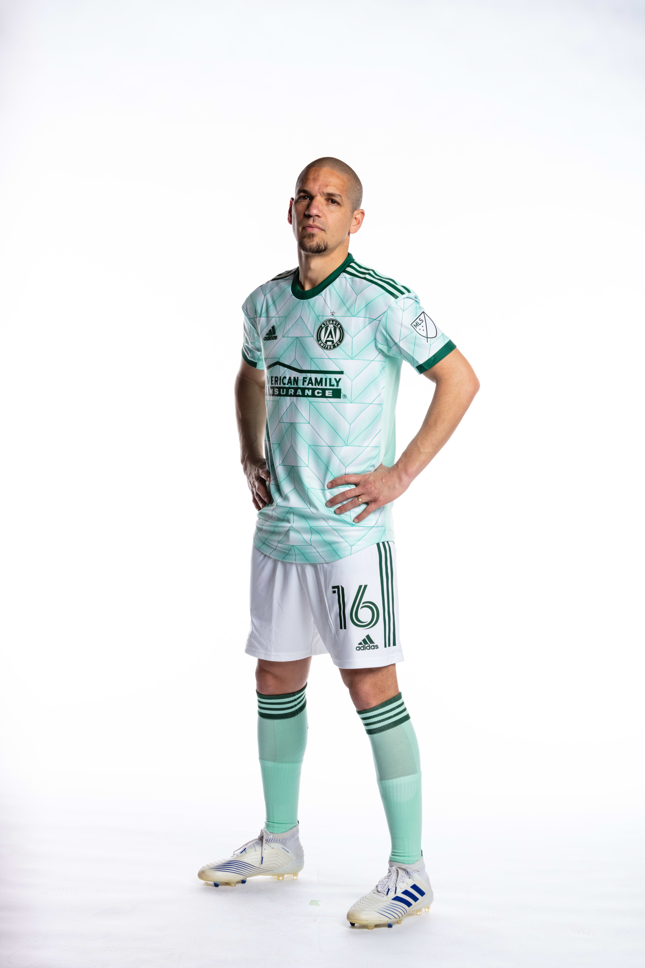
Atlanta United

The 5 Stripes say that this jersey is supposed to honor the city's green spaces. Meh. The design on the shirt is fine but something about the green on the shorts not matching the blue/green of the jersey bugs me 3/5
Austin FC

Austin's new addition just happens to be the same color as my own Yeti cooler. I like it on my cooler, not so much on them. Would've liked to see a little more creativity in this one. 2/5
Charlotte FC


Charlotte's entry into MLS brings two new jerseys: a gorgeous blue primary and a secondary that also exists. When the primary is paired with white shorts it will be one of the best looks in MLS. The secondary is just another uninspired black jersey that is all too common in MLS Primary: 5/5 Secondary 2/5
Chicago Fire FC

The "Men in Red" certainly look blue don't they? All in all it is a very boring jersey. Also would it kill them to release photos with the shorts and socks? The crest is much better though so it saves it at least one point. 1/5

FCC's secondary jersey is a great example about how just a bit of color can take your jersey from good to great. Orange is an underutilized color in sports and when you pair it with blue accents, it makes for a good looking jersey. 4/5
Colorado Rapids

The Rapids come into this year with a maroon and blue jersey with sublimated mountain patterns. I have always loved the Rapids shade of maroon and it's made even better by not having a shirt sponsor this year. 4/5
Columbus Crew

The Crew return to their traditional yellow after straying from it in recent years. The slight sublimated pattern is nice but probably won't be able to be seen from the stands. Still a solid 4/5
D.C. United

After a bold primary kit the last two years, DCU tones things down with a jersey very similar to what they wore in 2015/2016 when they had sublimated vertical stripes with red and white accents. As of writing, they have not released a shirt advertiser but I like more simple jerseys for DCU. Wish they would've stuck with red shorts though. 4/5 EDIT: After seeing the leaked shirt sponsor, this is being downgraded to a 2/5. DC does not need to associate itself with cryptocurrency.
FC Dallas

FC Dallas maintains their traditional look of hoops on a red shirt and blue shorts. Nothing really to complain about except the player in the photo (miss you paul). 3/5
Houston Dynamo

Houston came out with the "Bayou City" jersey. Now, I did not know that Houston was known as the "Bayou City" but I can't think of anything worse than playing in a black shirt in Houston in the summer. The design on the jersey seems a bit busy to me and I still don't really like the new crest. 2.5/5
Sporting KC

I've come to expect more out of SKC. This one leaves me wanting and seems a bit plain to me. Seems more like a training top. 2/5
LA Galaxy
 Oof. LA Galaxy have one of the most iconic looks in the league. The sash. They just...got rid of it to make a boring white t-shirt with some collar details. Not great Bob. 1/5
LAFC
 Now on this one, I'm torn. I love when LAFC lean into their Art Deco stylings, but I really don't like the crest in the middle, especially when the Adidas logo is above the crest. It gives the appearance that Adidas is more important to them than the team itself. 3/5
Inter Miami
 Inter Miami have finally gotten their pink jersey that everyone has been clamoring for. It even comes with a collar! I am a sucker for collars on sports jerseys. I hope that they pair this with black shorts and pink socks. 5/5
Minnesota United FC
 Minnesota comes in with an all black setup this year. I kinda dig the distressed vertical lines to break up the monotony and the black hearkens back to the loon on their crest. Normally I dislike black kits but I'll make and exception here. 3.5/5
CF Montreal

What happens when you take the popular Arsenal marble kit, mirror it and add blue? You get CF Montreal's new getup! It's not bad but at this point, it's certainly not ground breaking. The Impact (RIP) used to have such great looks but they seem to be losing their creativity a bit. 2/5
Nashville SC

Nashville turn up the volume on their original home kit by adding a loud side panel with their crest in the middle. I still don't like their colors, but I have to give them credit for trying something new. 3/5
New England Revolution

The revs debut their new crest on a new, dark blue with...I guess checkerboard pattern underneath? They really missed out on an opportunity to add a sash that matches their crest or to add anything of significance to the shirt. Pair that up with the dark blue shorts they're going to wear and you have one of the more boring looks in the league. 1/5
New York Red Bulls

The Metros show the Revs how to actually do checkerboards. It is good to see the Red Bulls go back to being, well, red. I still don't like teams being named after their advertisers and the giant advertisement on the back of the jersey is still ugly. 2.5/5
New York City FC

The Pigeons heard everyone complaining about boring uniforms in MLS and decided that they were going to fix that. This bold, NYC flag colored jersey certainly will turn some heads. Secondary jerseys are where you can really push the envelope and they certainly have done that here. 4/5
Orlando City SC

Orlando releases their "Sunshine" kit this year that will be paired with purple shorts. It's a creative shirt, but I really can't figure out what bothers me about it. I think the advertiser breaks up the effect a bit. 3/5
Philadelphia Union

If you just move that stripe over, it would be perfect. Philly had such a strong identity with the center stripe that I'm glad to see a stripe of any kind return, but it should take its rightful place in the middle of the jersey and not stand on the side like a middle school boy at a school dance. 3.5/5
Portland Timbers

Consistently one of the best dressed teams in MLS, Portland hit it out of the ballpark turned soccer stadium with this one. Now if only another team that has a flower associated with its city took notice... 5/5
Real Salt Lake

Its fine. 2/5
San Jose Earthquakes

Weird, the color on my laptop must be acting up. Wait, no, its just another lifeless white shirt. 0/5
Seattle Sounders

It must be the year of the checkerboard this year. At least the Sounders made the checkerboards solid instead of sublimating them. My only complaint is that I wish they didn't go in the "v" formation and kept them at a consistent size. 4/5
Toronto FC

Does anyone remember when the Revs did the half-and-half jersey a few years ago? TFC basically copied their homework but changed some things so the teacher wouldn't notice. We noticed. 1/5
Vancouver Whitecaps

Vancouver has been and will probably continue to be an absolute mess on the field. They will look good though! They have taken the horizontal stripe and made it their own. Paired with the white shorts, this is one of the best looks in MLS. 5/5
Overall, MLS teams have done a much better job than in recent years creating on the field looks for their teams. I am pleasantly surprised with how this year's releases went.
Loading comments...