Hey everyone!
I decided that I was going to bring out my inner uni-nerd and do a kit review of the 2018 MLS Kits. I'll be reviewing the primary and secondary kit, including the socks and shorts. Theres more to a great kit than just the shirt! I will rank each home and away kit and then average the scoresfor an overall rank. So, without further ado, lets get started.
Atlanta United
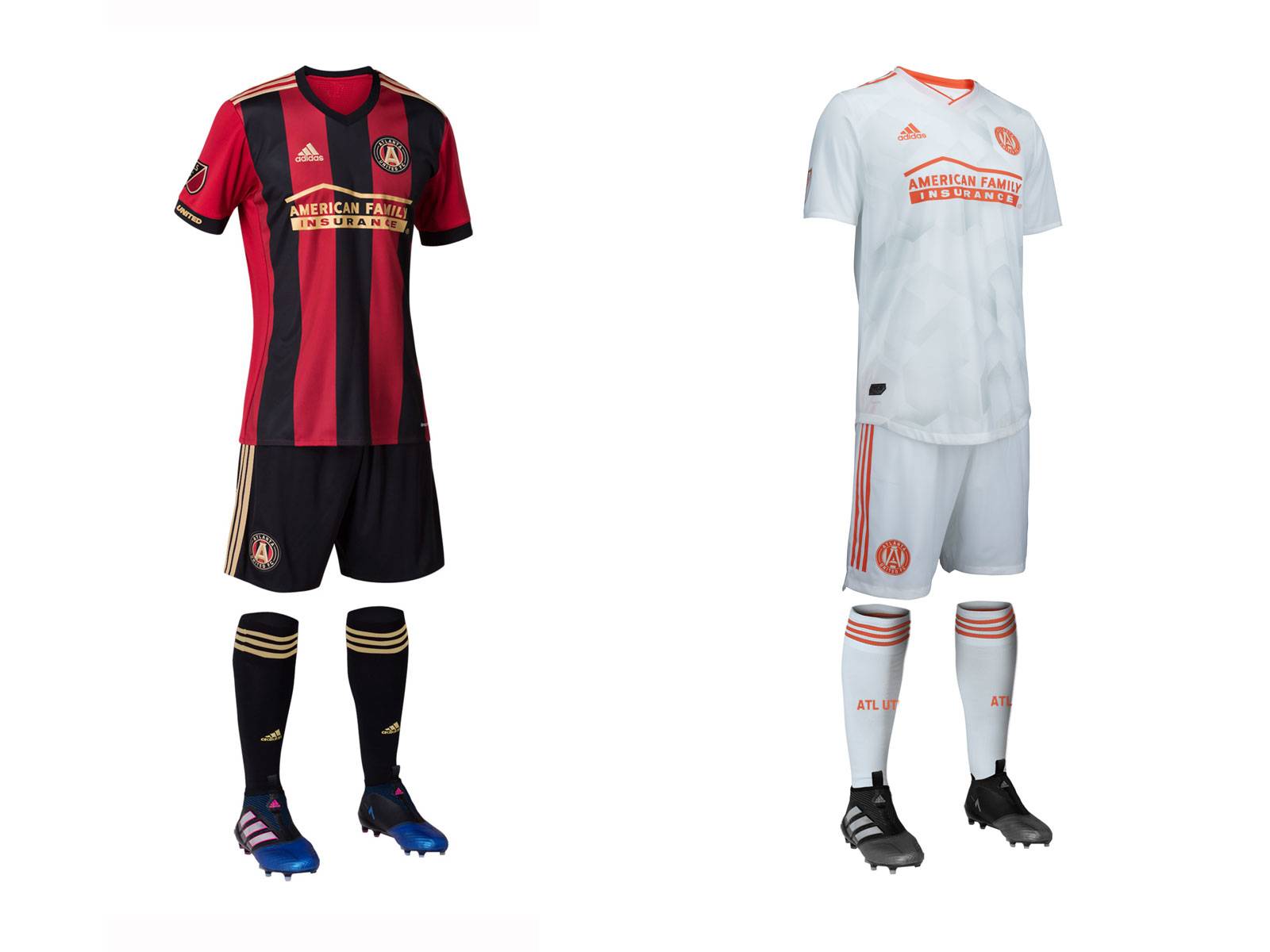
The gorgeous primary kit returns from last year. The gold accents and numbers really pop against the red base. The new secondary is supposed to be inspired by Georgia's peaches. Its ok in my opinion. I think the pink will look more like red on the pitch. I would have made the shorts peach to give a little more splash of color to the secondaries.
Primary: 5/5
Secondary: 2/5
Overall: 3.5/5
Chicago Fire
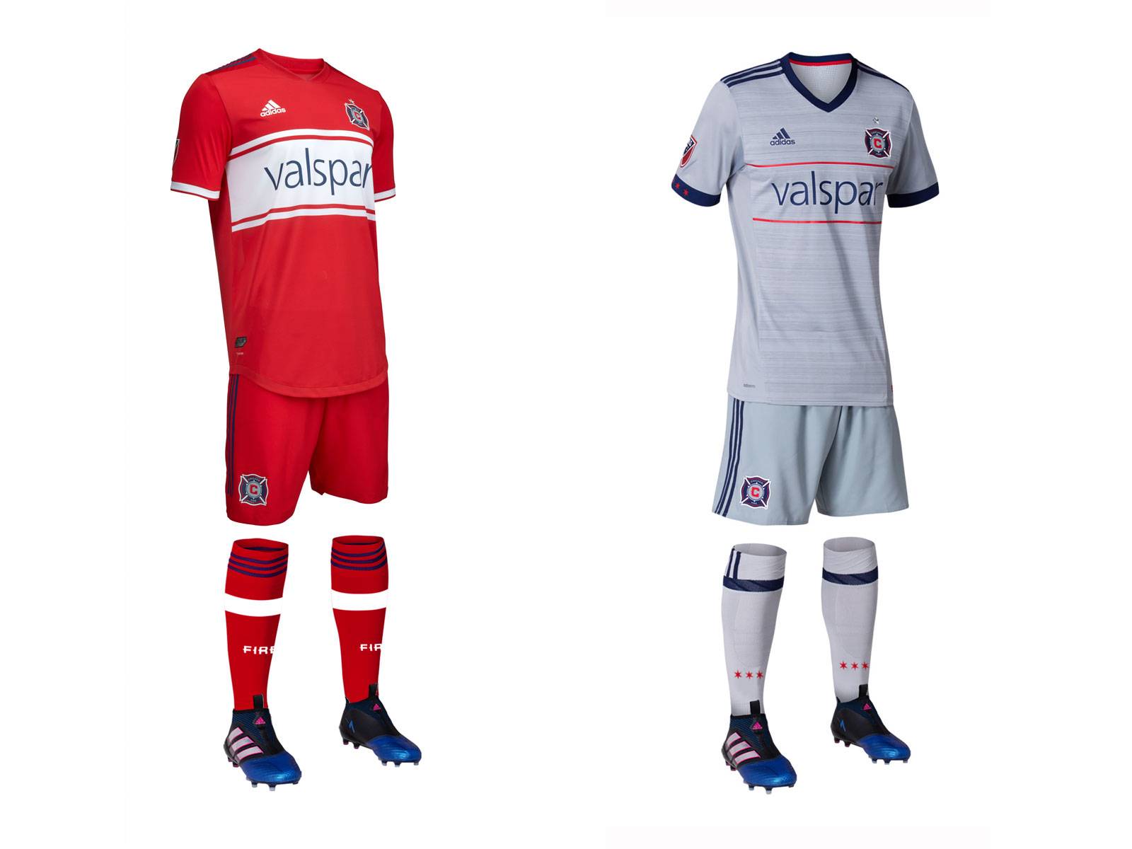 Chicago is throwing it back for their new primary. The gigantic white stripe is inspired by their 1998 and 1999 primary jerseys. It is an iconic look that I'm sure the fans in Chicago will love. The grey secondary returns from last year. It took me a while to warm up to this one, but I now think it is sharp and does a nice job at completing the look for the Fire
Primary: 4/5
Secondary: 4/5
Overall: 4/5
Colorado Rapids
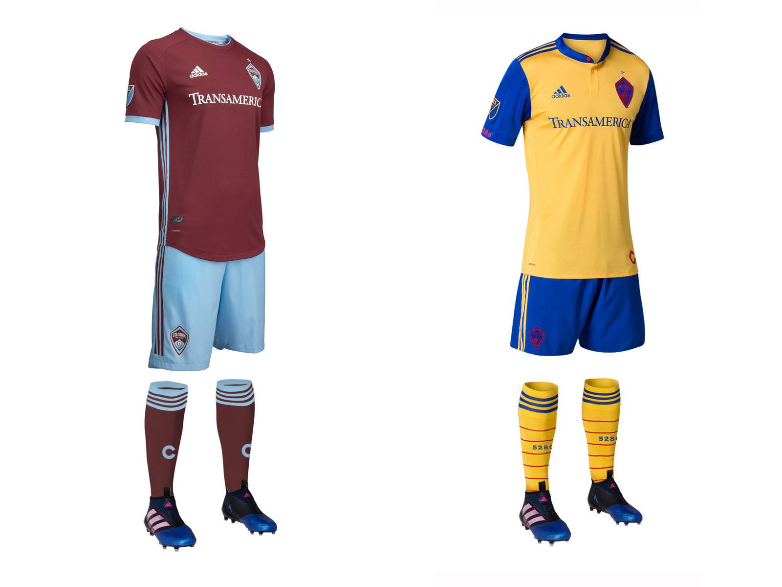 The new Rapids primary is the perfect example on why you should never judge a uniform by the shirt only. The shirt by itself is quite boring, but when paired with the beautiful sky blue shorts, it creates a unique and very appealing look for Colorado. The flag inspired secondary returns this year. Its never been my favorite, but it works.
Primary: 4.5/5
Secondary: 3/5
Overall: 3.75/5
Columbus Crew
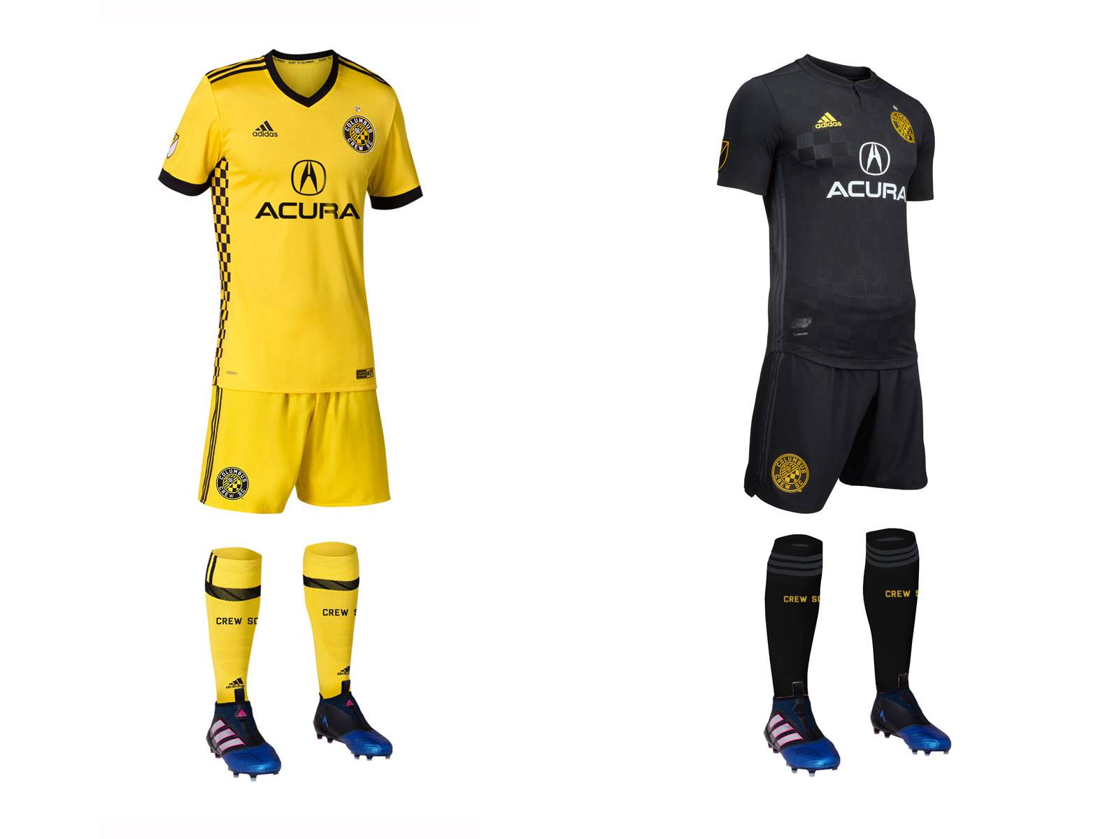 The Crew introduced a new all back secondary kit for 2018. It is just too black for me. They should have at least made the adidas stripes yellow and thrown some more yellow on the socks to make it not seem like they are going to a funeral. The yellow primary returns from last year, keeping the awesome checkerboard side stripes.
Primary: 4/5
Secondary: 2/5
Overall: 3/5
D.C. United
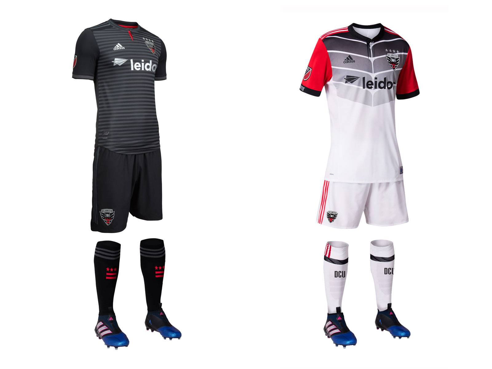 I love the new primary. My only complaint is that there just needs to be a tiny bit more red. I like how the stripes are visible on the field and the silver numbers are a nice little twist from years past. Let's not talk about that secondary though. Woof.
Primary: 5/5
Secondary: 1/5
Overall: 3/5
FC Dallas
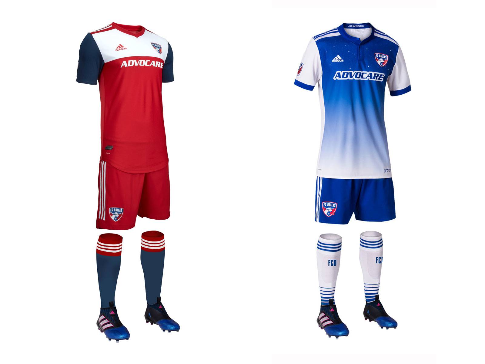 FC Dallas just took a class on how to destroy an iconic look 101. Gone are the hoops, replaced by what is supposed to be a Texas flag. To be honest it looks more like last year's Fire primary. The "stars over Texas" secondary returns from last year. Its a good look, but placing stars around the crest when you have none on top.
Primary: 2/5
Secondary: 2/5
Overall: 2/5
Houston Dynamo
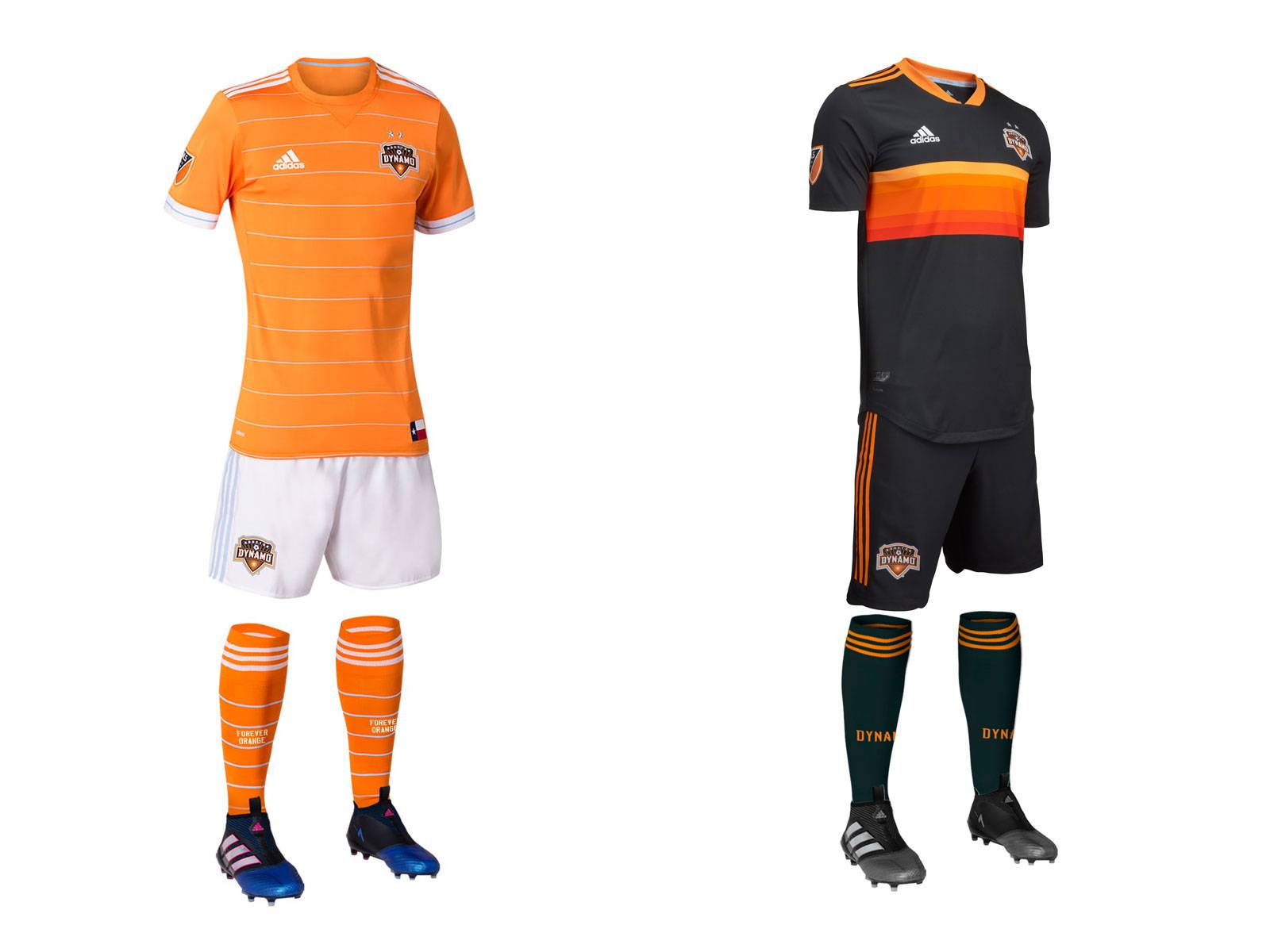 The Orange primary from last year returns. I think this is Houston's best ever primary kit. The white shorts are sharp and the orange is iconic. I would just make the sky blue stripes just a tiny bit thicker so that they are viewable on the pitch. They have introduced a beautiful new black secondary featuring a "tequila sunrise" pattern made famous by the Astros in the 1970's. If you're going to have a black secondary kit, make it distinctive (looking at you, half of MLS).
Primary: 4.5/5
Secondary: 4/5
Overall: 4.25/5
Los Angeles FC
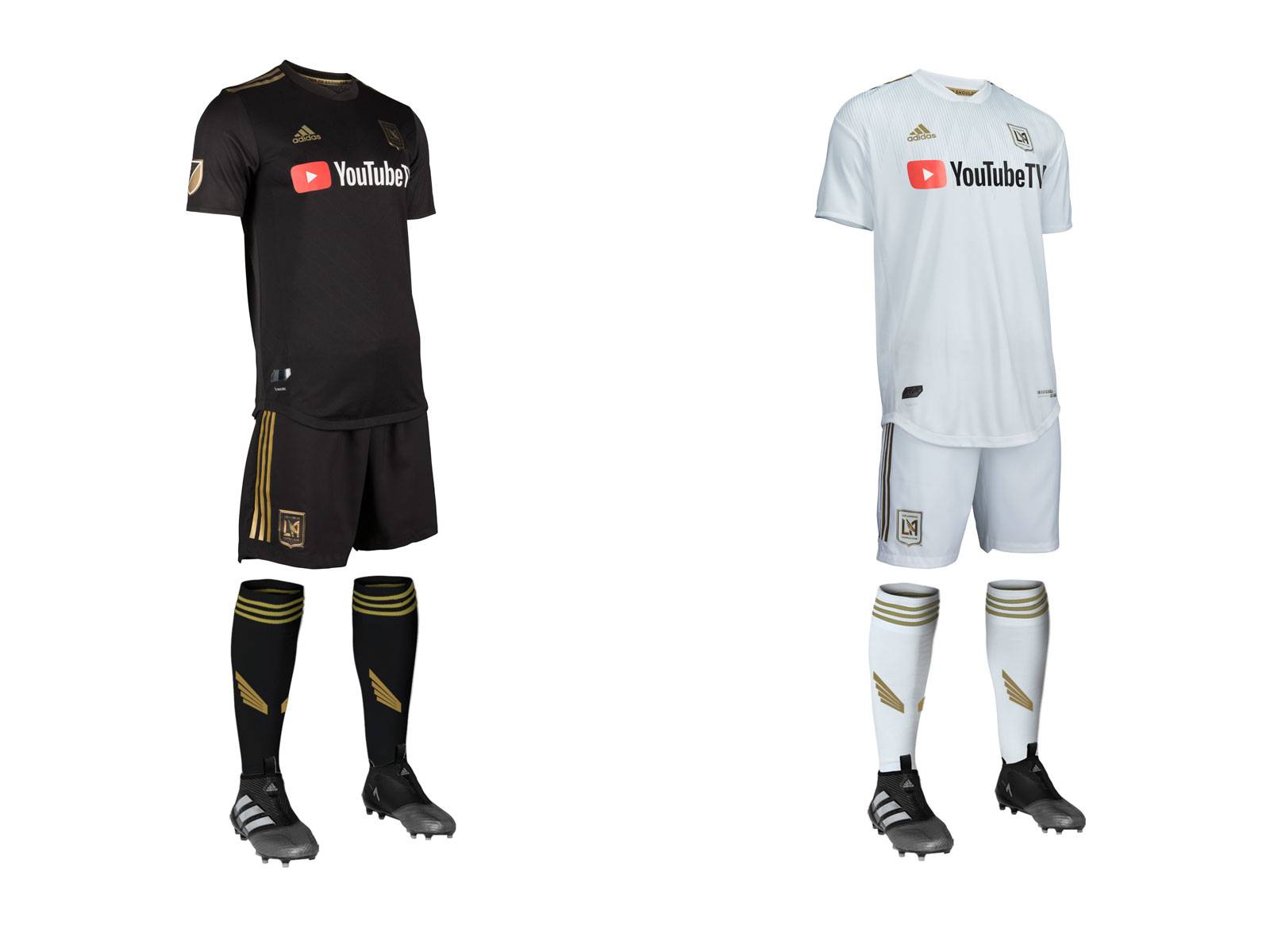 Well, LAFC have 2 shirts, 2 shorts and some socks, there will be soccer played in them. Could they have put any less effort into these. They took DC's jersey and added ATL's accents and called it a day.
Primary: 1/5
Secondary: 1/5
Overall: 1/5 (and I feel like that's generous)
LA Galaxy
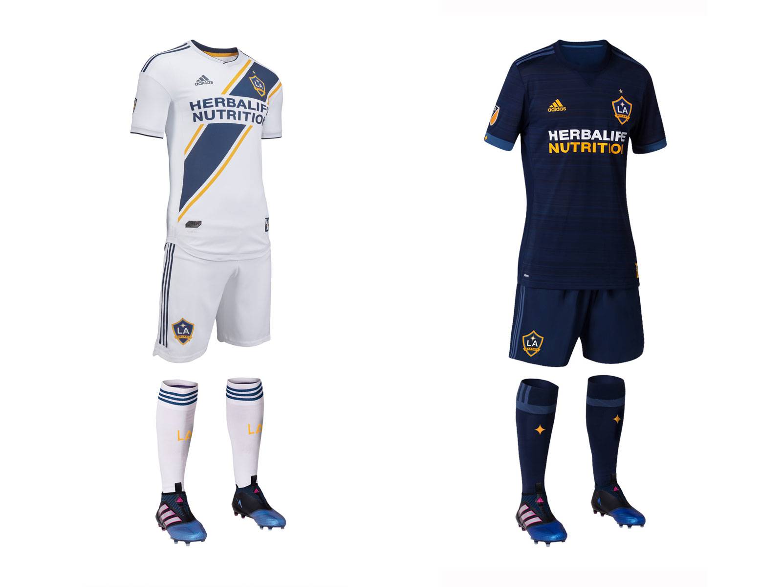 The Galaxy add a new iteration of its classic all white strip with a sash. I don't like this sash nearly as much as last year's. It's a little too thick. A good sash can make a great uniform but a bad sash can ruin one. This falls into the latter. The deep blue secondary returns from last year. This one is only worn once or twice a year so its good for what it is.
Primary: 3/5
Secondary: 3/5
Overall: 3/5
Minnesota United
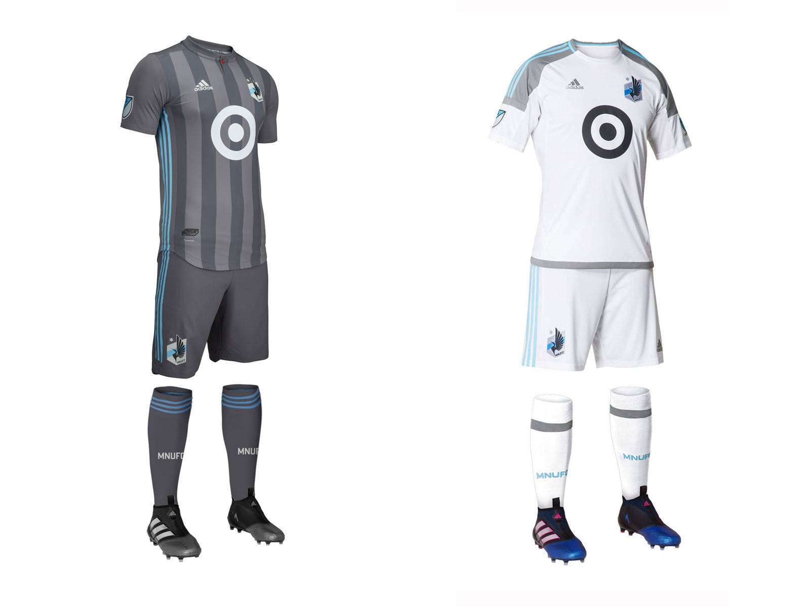 I'm not going to lie, I love the new primary. It is a huge upgrade over the lighter grey, sashed version from last year. I tend to be a sucker for vertical stripes done well, and I think that these are. Also, the one red button on the collar is supposed to mirror the loon's eye on the crest. It makes a very cohesive kit. The average white secondary comes back from last year.
Primary: 5/5
Secondary: 3/5
Overall: 4/5
Montreal Impact
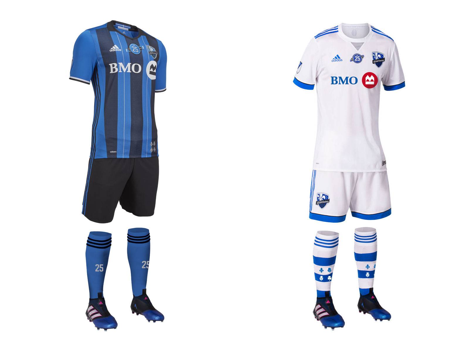 Hey, did you know that its the Impact's 25th anniversary? I'm all for celebrating anniversaries with a patch, but also having it on the socks is a little bit much. The kits themselves didn't change, but the addition of the 25th anniversary patch in the center of the chest really makes it too busy, especially on the primary. The secondary remains boring except for the magnificent socks.
Primary: 3.5/5
Secondary: 2/5
Overall: 2.75/5
New England Revolution
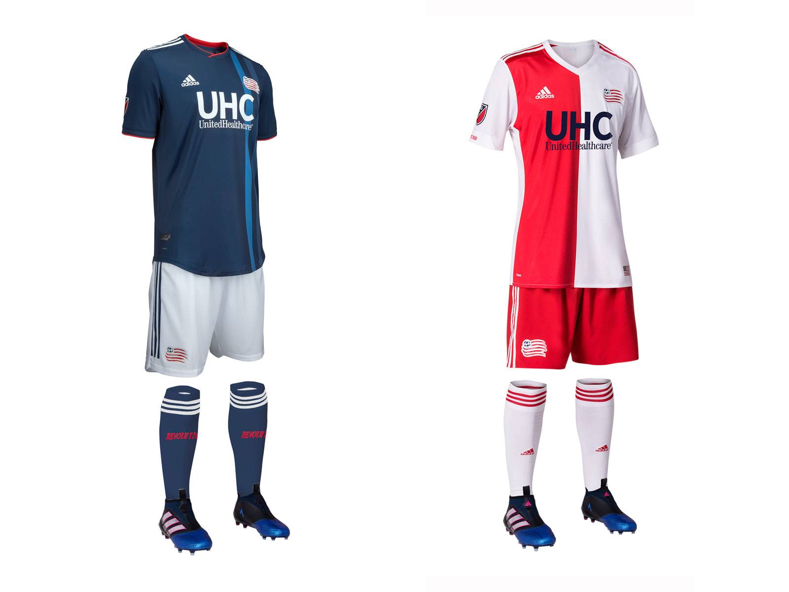 The 2016/2017 Primary jersey was so good that I thought it should be used as the USMNT kit. This year feels like a significant downgrade. Gone is the split red and white center stripe, replaced by a blue and slightly darker blue stripe on a blue base. The secondary is simple, unique, and appealing, like most secondaries should be. The rest of MLS should take note instead of going straight to a black or grey kit.
Primary: 2/5
Secondary: 4/5
Overall: 3/5
New York City FC
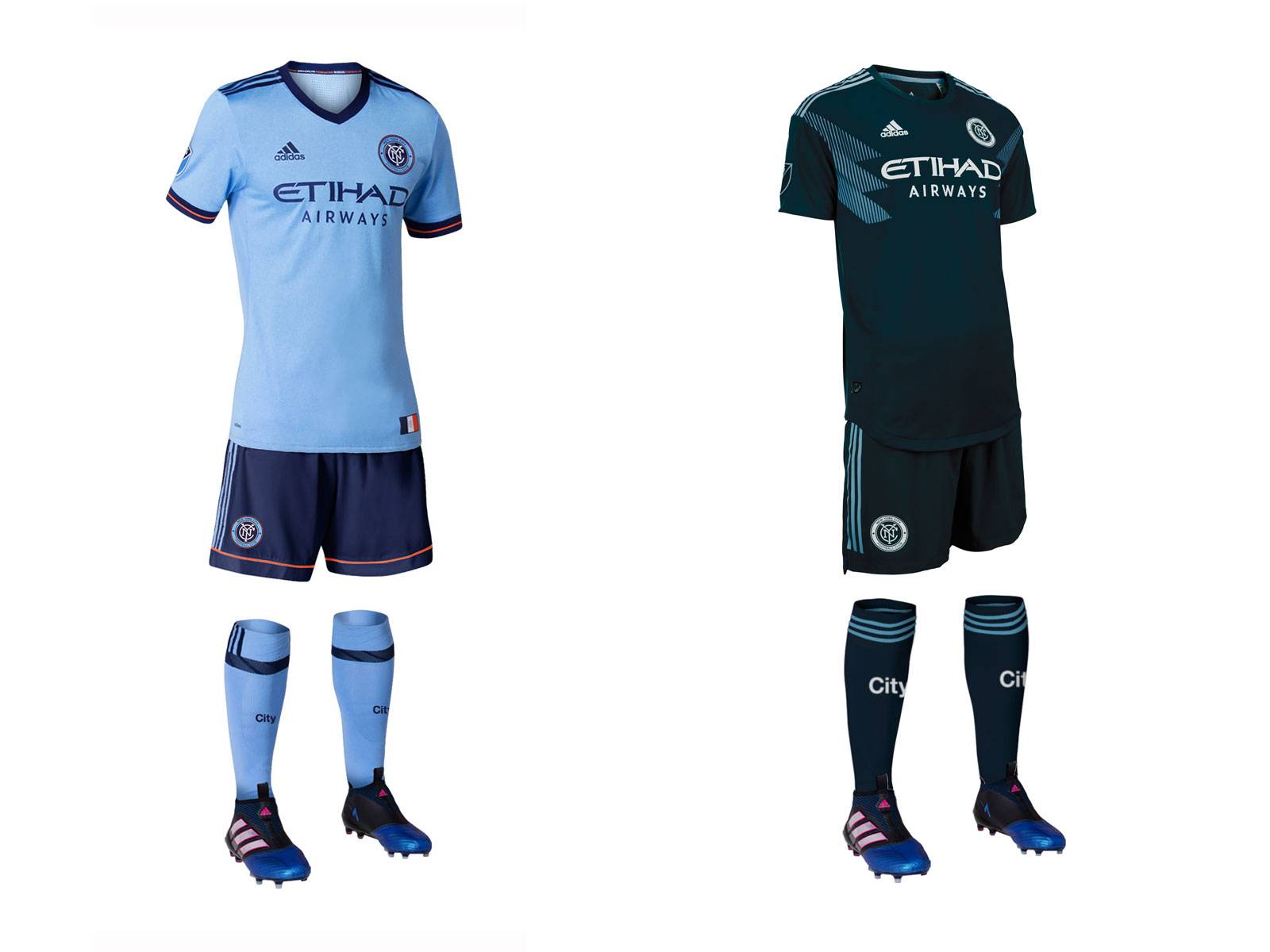 The Pigeons return with their sky blue shirt and socks with either white or navy blue shorts. I prefer the white shorts to the navy, but they tend to wear the navy more. The secondary is a recolored version of Columbia's kit for the World cup, but I think it works for NYCFC. They don't need to wear their secondaries too often, but this should look decent on the field
Primary: 4/5
Secondary: 3/5
Overall: 3.5/5
New York Red Bulls
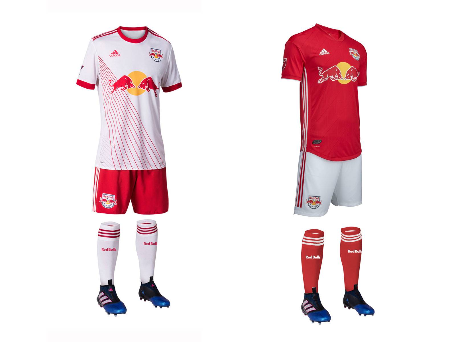 New Jersey comes into this year adding a red secondary jersey for the first time since they're initial rebrand. It looks more like a training top to me so its hard to give it too many points. The primary returns from last year which features a pattern that is supposed to look like New York's bridges, but it looks more like emanating armpit stench to me.
Primary: 2/5
Secondary: 2/5
Overall: 2/5
Orlando City SC
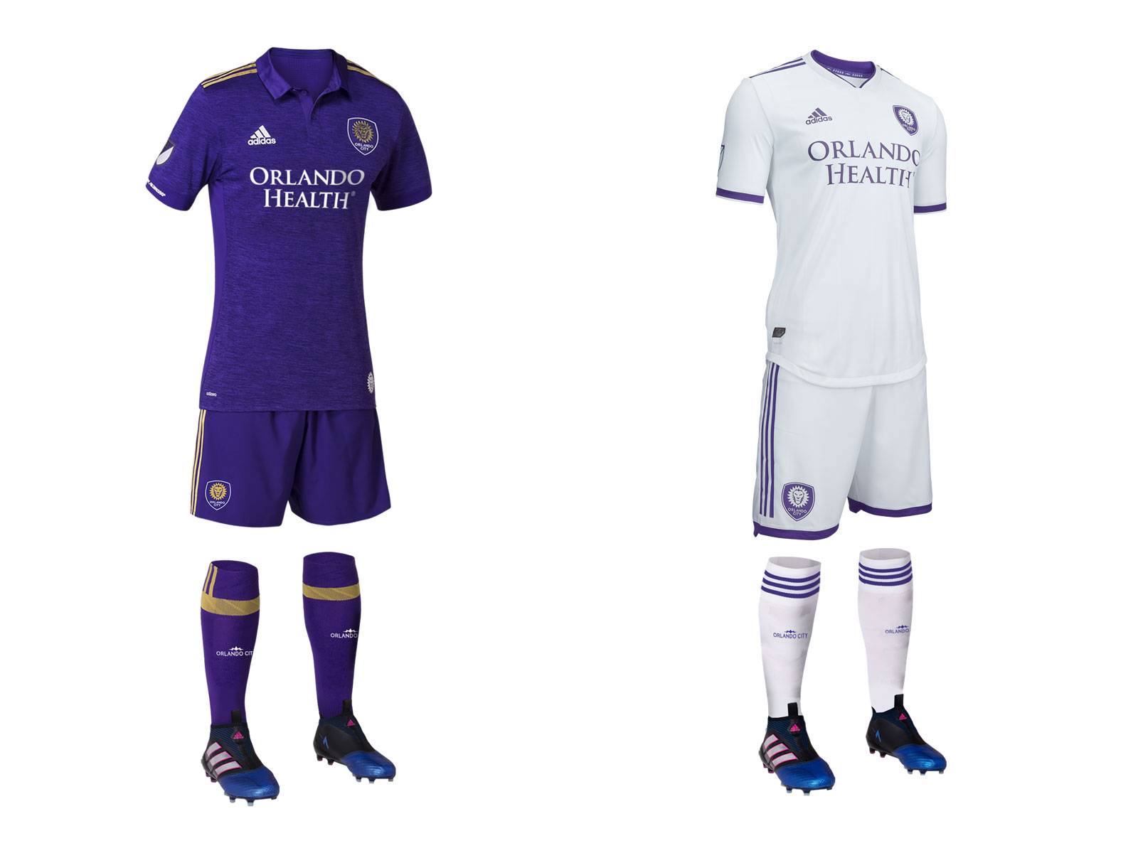 I really like the primary that comes back from last year. I think purple is an underused color and the gold accents mirror the club's crest. I'm also a sucker for collars, so this kit checks a lot of boxes. The secondary puts me to sleep. At least add some purple shorts or some gold in there.
Primary: 4.5/5
Secondary: 2/5
Overall: 3.25/5
Philadelphia Union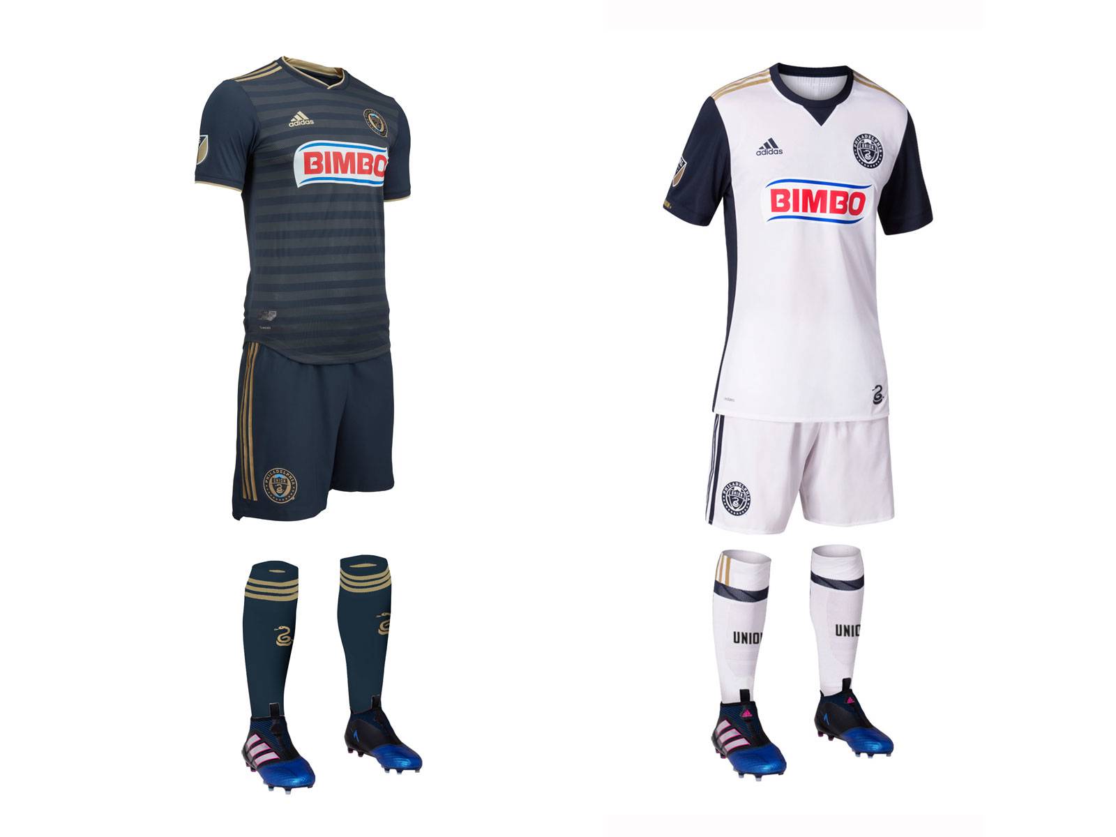 If FC Dallas took the 101 course on destroying a team's identity, the union were the ones teaching that course. The gold center stripe that has been there since the club's inception is gone, and it was replaced by sublimated horizontal stripes. The center stripe made the Union's look iconic on a global scale and now its gone. The secondary is another bland white uniform in a sea of white MLS secondary uniforms. And please, can they get a new shirt advertiser!
Primary: 0/5
Secondary: 1/5
Overall: 0.5/5
Portland Timbers
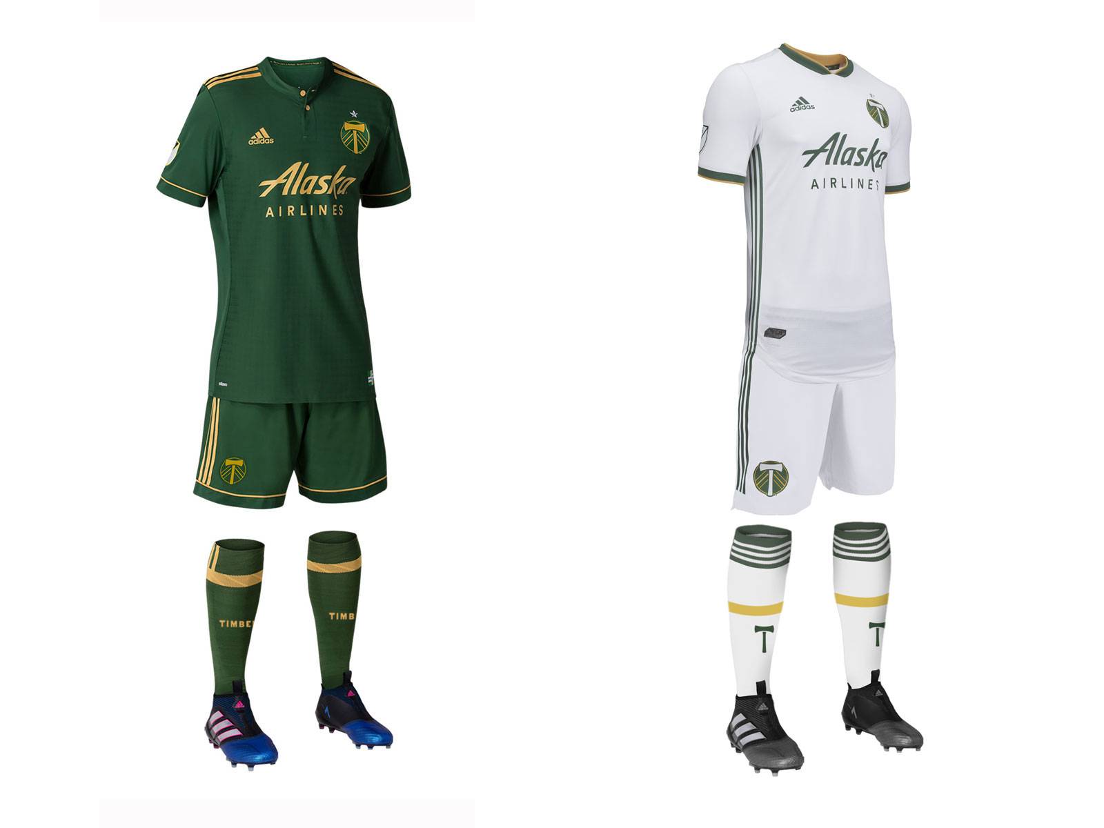 What is with teams abandoning great uniforms for bland white/grey kits? The Timbers had a great thing going with their "rose city red" secondary kits, but the were replaced with another all white kit in a league full of them this year. They pull this white kit off better than most of the league though. Their primary from last year returns. Green and gold are such a great combination, it is hard to screw it up.
Primary: 4/5
Secondary: 3/5
Overall: 3.5/5
Real Salt Lake
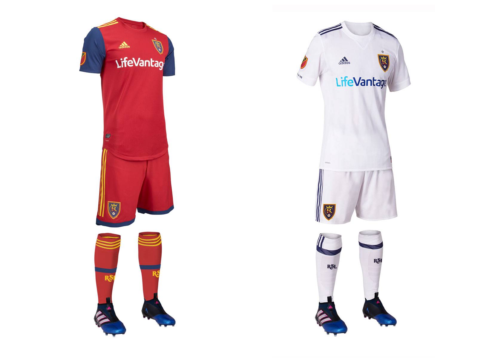 I will and say it one time and one time only: BRING BACK THE BLUE SHORTS! The blue sleeves on the new primary are welcomed, but with too many all red kits in the league, RSL would be well served to have their blue shorts make a comeback. The secondary from last year returns. Snore
Primary: 3.5/5
Secondary: 1/5
Overall: 2.25/5
San Jose Earthquakes
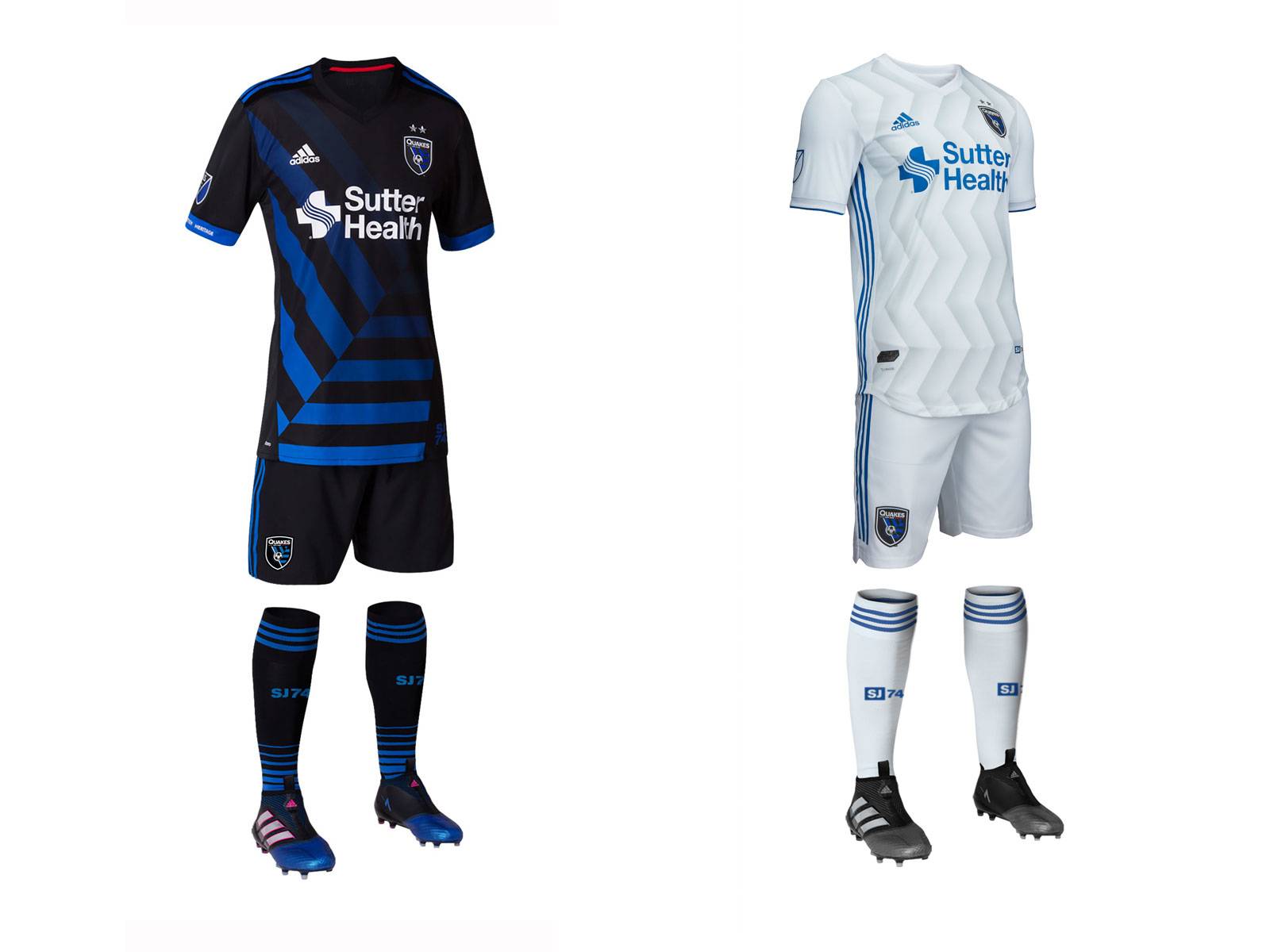 San Jose brings back their black and blue primary from last year. I like the design in a vacuum, but the blue stripes don't show as well in Avaya Stadium, which seems to have not the best lighting system in the world. The new white kit had a sublimated zig zag pattern that should give it a little bit of texture on TV but it might be hard to see from the stands.
Primary: 3/5
Secondary: 3/5
Overall: 3/5
Seattle Sounders
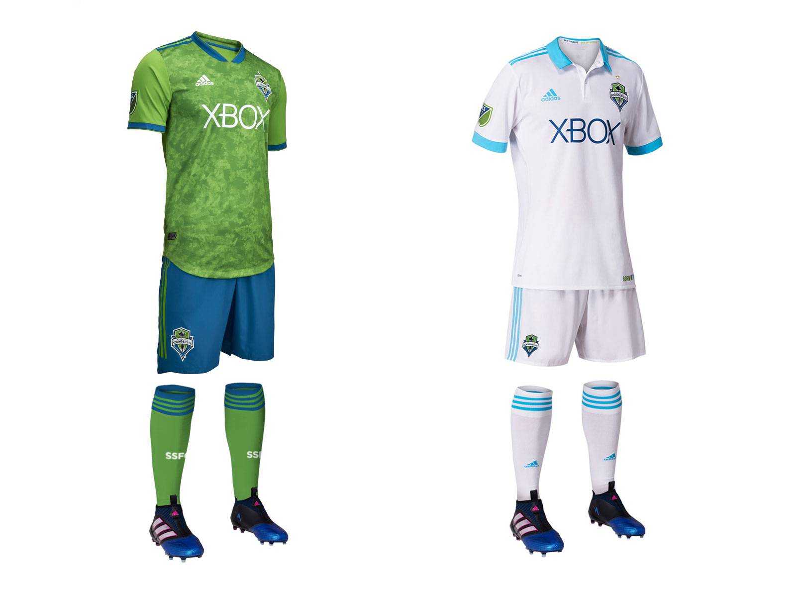 I have never been a fan of Seattle's "rave green" color, but they certainly own it and it is synonymous with the Emerald City. That being said, I hate how the textured pattern stops at the sleeves on their new primary. If you're going to have an out there pattern like that, own it. Having the sleeves plain destroys the cohesiveness of the kit. Their returning secondary is a beauty though. Throwback to the 1970s? Check. Collar? Check. It would only be better if they used the old sounders logo instead of the modern one.
Primary: 2/5
Secondary: 4/5
Overall: 3/5
Sporting Kansas City
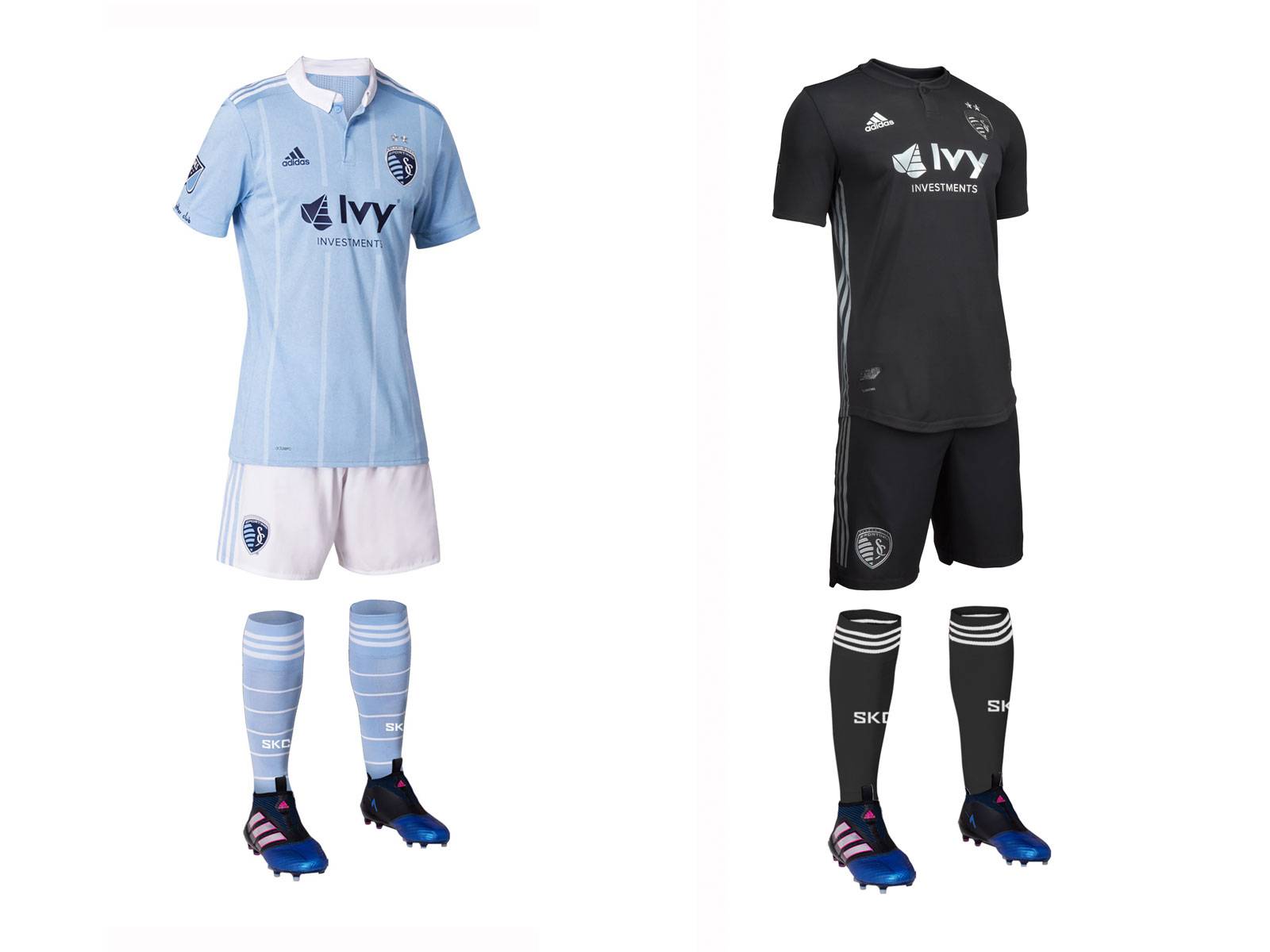 The Sporks used to be the most creative jersey designers in MLS. This year they decided to copy half of the league and go with an all black secondary, devoid of creativity or club symbolism. The Primary is nice though, with their collar, thin vertical stripes and a beautiful shade of sky blue.
Primary: 4.5/5
Secondary: 2.5/5
Overall: 3.5/5
Toronto FC
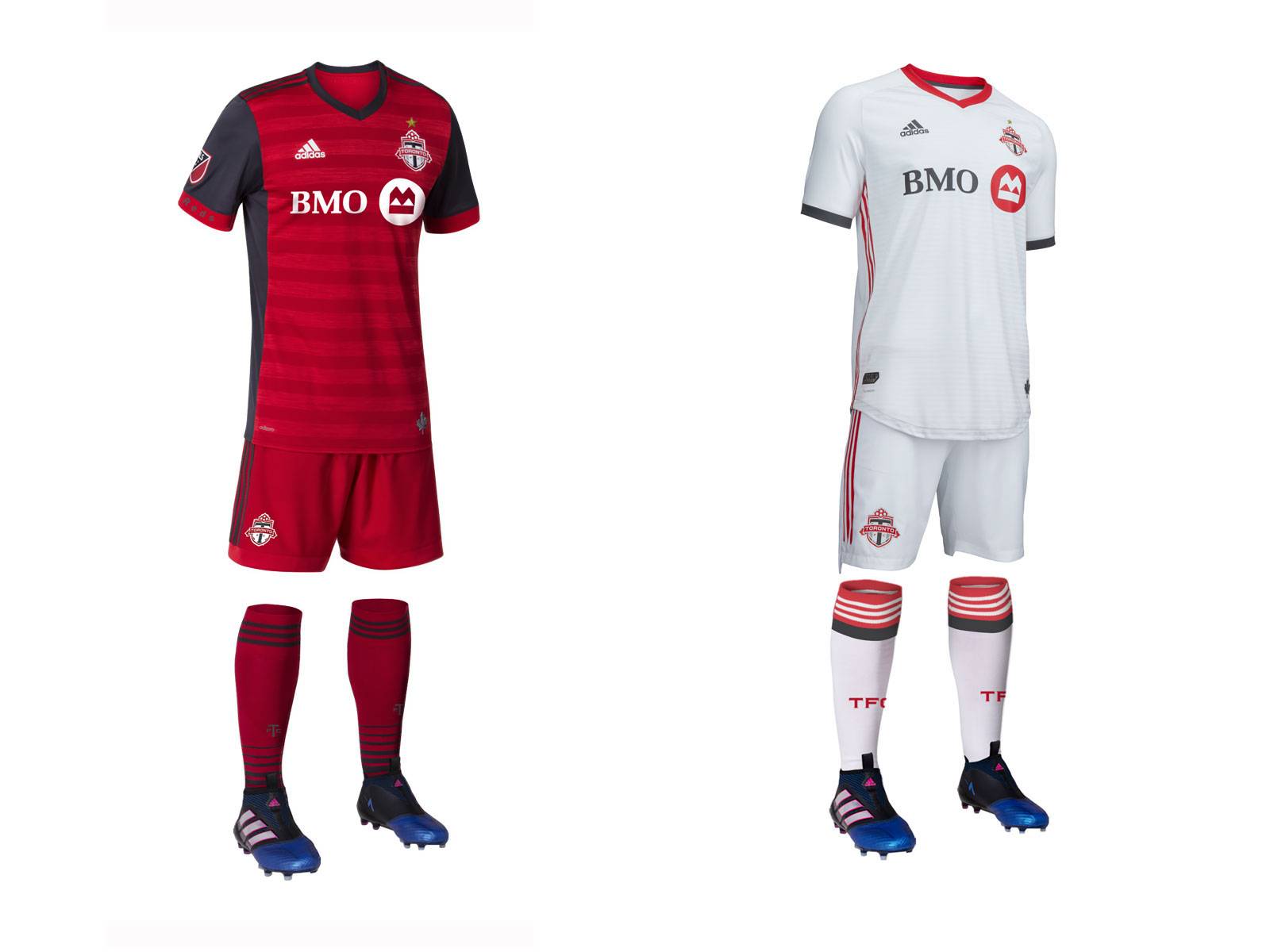 TFC's Treble winning red returns. It's a good look without much to complain about and is now iconic for the club. They have added an all white secondary this year. They could have used red shorts to make it stand out from the crowd.
Primary: 4/5
Secondary: 2/5
Overall: 3/5
Vancouver Whitecaps
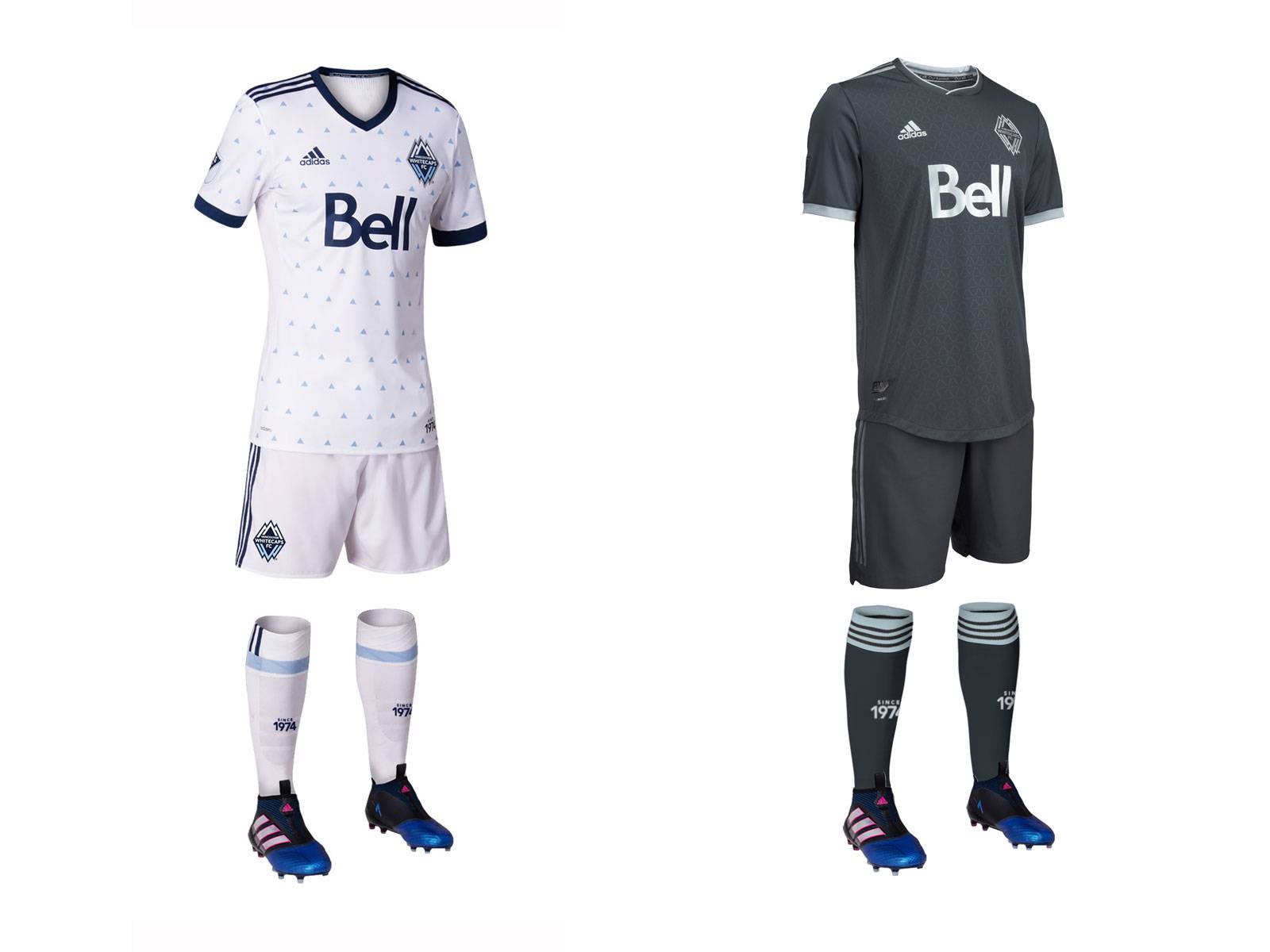 Vancouver decided to replace one of the best, most eye catching jerseys in the league with...an all grey secondary. Why is this a theme this year? They bring back their all white primary strip from last year. I still can't shake the fact that the jersey looks like a pajama top.
Primary: 3/5
Secondary: 1/5
Overall: 2/5
If anyone disagrees with any of my takes, feel free to leave a comment below. Thanks for reading everyone!
